In this article, we will continue finding out something about bootstrap 4.
Let’s get started.
Table of Contents
Menu
In bootstrap 4, there are two types of menu. It includes:
- horizontal menu
- vertical menu
To make horizontal menu, add the .nav class to a <ul> element, followed by .nav-item for each <li> and add the .nav-link class to their links.
To make the vertical menu, add the .flex-column class into the <ul> element that is behind the .nav class.
Ex:
 <ul class="nav">
  <li class="nav-item">
    <a class="nav-link" href="#">Html</a>
  </li>
  <li class="nav-item">
    <a class="nav-link" href="#">Javascript</a>
  </li>
</ul>
To make the tabs, you can add the .nav-tabs class in <ul> element.
Jumbotron
A jumbotron indicates a big grey box for calling extra attention to some special content or information.
Use .jumbotron or .jumbotron-fluid classes to create a jumbotron. Inside of .jumbotron-fluid, you can insert the .container or .container-fluid classes to make a full-width jumbotron without rounded borders.
Ex:
<div class="jumbotron jumbotron-fluid">
  <div class="container">
    ...
  </div>
</div>
Collapse with button and anchor
When you want to hide the contents of the other elements, you can use .collapse class to set collapsable state for these elements.
To control (show/hide) the collapsible content, add the data-toggle=”collapse” attribute to an <a> or a <button> element. Then add the data-target=”#id” attribute to connect the button with the collapsible content (<div id=”demo”>).
Ex:
<button data-toggle="collapse" data-target="#collapsedElement">Click</button>

<div id="collapsedElement" class="collapse">
  ...
</div>
Before we practice collapsing with button, now, we will continue with anchor.
With anchor, we will do something like collapse with button. But replacing the data-target property in collapse with button, use href property in <a>.
<div class="content">
   <a class="btn btn-primary" data-toggle="collapse" href="#collapse_target">Click here</a>

   <div id="collapse_target" class="collapse">
      Lorem ipsum dolor text....
   </div>
</div>
Apart from <a> element that is used with href, all other tags can be used with data-target.
The Bootstrap collapse plugin requires the two elements to work properly - the controller element such as a button or hyperlink by clicking on which you want to collapse the other element, and the collapsible element itself.
-
The
data-toggle="collapse"attribute is added to the controller element along with a attributedata-target(for buttons) orhref(for anchors) to automatically assign the control of a collapsible element. -
The
data-targetorhrefattribute accepts a CSS selector to apply the collapse to a specific element. Be sure to add the class.collapseto collapsible element. -
We can optionally add the class
.into the collapsible element, we can utilize the Bootstrap panel component.
To gain more information about collapsing elements, we can refer to the link.
Accordion
Be simplicity, accordion contains many collapsable elements. Accordion allows showing only one collapsed element at the same time.
<div id="accordion" class="panel-group">
   <div class="panel panel-default">
      <div class="panel-heading">
            <h4 class="panel-title">
               <a data-toggle="collapse" data-parent="#accordion" href="#collapseOne">1. What is HTML?</a>
            </h4>
      </div>

      <div id="collapseOne" class="panel-collapse collapse in">
            <div class="panel-body">
               <p>HTML stands for HyperText Markup Language. HTML is the standard markup language for describing the structure of web pages. <a href="https://www.tutorialrepublic.com/html-tutorial/" target="_blank">Learn more.</a></p>
            </div>
      </div>
   </div>

   <div class="panel panel-default">
      <div class="panel-heading">
            <h4 class="panel-title">
               <a data-toggle="collapse" data-parent="#accordion" href="#collapseTwo">2. What is Bootstrap?</a>
            </h4>
      </div>

      <div id="collapseTwo" class="panel-collapse collapse in">
            <div class="panel-body">
               <p>Bootstrap is a sleek, intuitive, and powerful front-end framework for faster and easier web development. It is a collection of CSS and HTML conventions. <a href="https://www.tutorialrepublic.com/twitter-bootstrap-tutorial/" target="_blank">Learn more.</a></p>
            </div>
      </div>
   </div>

   <div class="panel panel-default">
      <div class="panel-heading">
            <h4 class="panel-title">
               <a data-toggle="collapse" data-parent="#accordion" href="#collapseThree">3. What is CSS?</a>
            </h4>
      </div>

      <div id="collapseThree" class="panel-collapse collapse">
            <div class="panel-body">
               <p>CSS stands for Cascading Style Sheet. CSS allows you to specify various style properties for a given HTML element such as colors, backgrounds, fonts etc. <a href="https://www.tutorialrepublic.com/css-tutorial/" target="_blank">Learn more.</a></p>
            </div>
      </div>
   </div>
</div>
$(document).ready(function(){
   // Add minus icon for collapse element which is open by default
   $(".collapse.in").each(function(){
      $(this).siblings(".panel-heading").find(".glyphicon").addClass("glyphicon-minus").removeClass("glyphicon-plus");
   });

   // Toggle plus minus icon on show hide of collapse element
   $(".collapse").on('show.bs.collapse', function(){
      $(this).parent().find(".glyphicon").removeClass("glyphicon-plus").addClass("glyphicon-minus");
   }).on('hide.bs.collapse', function(){
      $(this).parent().find(".glyphicon").removeClass("glyphicon-minus").addClass("glyphicon-plus");
   });
});
Dropdown state
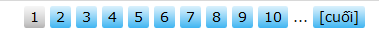
Pagination
Pagination is used to go to the other pages in website quickly. The pagination have the image:
To create a basic pagination, add the .pagination class to an <ul> element. Then add the .page-item to each <li> element and a .page-link class to each link inside <li>:
About adjusting the size of pagination, you have some classes such as pagination-sm, pagination-lg.
Ex:
<ul class="pagination pagination-sm justify-content-left">
  <li class="page-item disabled"><a class="page-link" href="#">1</a></li>
  <li class="page-item"><a class="page-link" href="#">1</a></li>
  <li class="page-item active"><a class="page-link" href="#">2</a></li>
  <li class="page-item"><a class="page-link" href="#">...</a></li>
  <li class="page-item"><a class="page-link" href="#">Final</a></li>
</ul>
Form
Bootstrap has 3 ways to arrange the elements in the form.
- Use .form-group to organize elements vertically
- Use .form-inline to organize element horizontally
- Put the elements into the Grid system, you can use the .form-row class.
Ex:
<form>
<!-- Vertically -->
<div class="form-group">
    <label for="myEmail">Email</label>
    <input type="email" id = "myEmail" class="form-control" placeholder="Email">
    <label for="myPassword">Password</label>
    <input type="password" id="myPassword" class="form-control" placeholder="Password">
    <button type="submit" class="btn btn-primary">Submit</button>
</div>
</form>
<form>
   <!-- Horizontally -->
   <div class="form-inline">
      <label for="myEmail">Email</label>
      <input type="email" id="myEmail" class="form-control" placeholder="Email">
      <label for="myPassword">Password</label>
      <input type="password" id="myPassword" class="form-control" placeholder="Password">
      <button type="submit" class="btn btn-primary">Submit</button>
   </div>
</form>
<form>
   <!-- Grid -->
   <div class="row">
      <div class="col-6 col-sm-4">
         <input type="text" class="form-control" placeholder=".col-6 .col-sm-4">
      </div>
      <div class="col-6 col-sm-8">
         <input type="text" class="form-control" placeholder=".col-6 .col-sm-8">
      </div>
   </div>
</form>
<form>
   <!-- Grid - form-row -->
   <div class="form-row">
      <div class="col-6 col-sm-4 form-group">
         <label>Product Code</label>
         <input type="text" class="form-control" placeholder=".col-6 .col-sm-4">
      </div>
      <div class="col-6 col-sm-8 form-group">
         <label>Product Name</label>
         <input type="text" class="form-control" placeholder=".col-6 .col-sm-8">
      </div>
   </div>
</form>
The following are the controls that is used in the form.
- Use .btn class with type=button|reset|submit for button control.
- Use form-check-input, .form-check-label classes with type=checkbox|radio to make the checkbox or radio for input control.
- Use form-control class with type=text|password|email|search|url|tel|number|color|date|time|datetime-local|month|week for input control.
- Use .form-control-file class with type=file.
- Use .form-control-range class with type=range.
Thanks for your reading.