In order to improve the speed of making the website, I think that I have to learn about Bootstrap framework immediately. Because with bootstrap, you can easily make the website fast.
The belows is some basic titles about Bootstrap.
Table of Contents
Use bootstrap framework
There are two ways to use the bootstrap, it includes:
- Use the link to bootstrap files in the internet.
<!doctype html>
<html lang="en">
<head>
    <!-- ... -->
    <!-- the compression css file of bootstrap 4 -->
    <link rel="stylesheet" href="https://maxcdn.bootstrapcdn.com/bootstrap/4.0.0-beta.2/css/bootstrap.min.css">

</head>
<body>
    <!-- ... -->
    <div class="container-fluid">
      <!-- do something here -->
    </div>

    <!-- The compression Jquery library is used for bootstap.min.js -->
    <script src="https://ajax.googleapis.com/ajax/libs/jquery/3.2.1/jquery.min.js"></script>
    <!-- The compression popper library is used for bootstrap.min.js -->
    <script src="https://cdnjs.cloudflare.com/ajax/libs/popper.js/1.12.6/umd/popper.min.js"></script>
    <!-- The compression js file of bootstrap 4, it should be lied before body tag-->
    <script src="https://maxcdn.bootstrapcdn.com/bootstrap/4.0.0-beta.2/js/bootstrap.min.js"></script>
</body>
</html>
- Download the bootstrap 4 at Link bootstrap 4
In order to download all necessary files in bootstrap 4, you can get from the links:
- file bootstrap.min.js and bootstrap.min.css: it is in the Compiled CSS and JS of website https://getbootstrap.com/docs/4.0/getting-started/download/
- file popper.min.js: https://github.com/FezVrasta/popper.js
- file jquery.min.js: you can google for this file.
- The new feature of bootstrap 4 compares with bootstrap 3:
- Bootstrap 4 uses the Flexbox Grid, bootstrap 3 uses the float method.
- Bootstrap 4 uses rem CSS units, bootstrap 3 uses px units.
Container
There are two container classes to choose from:
- .container class provides a responsive fixed width container.
- .container-fluid class provides a full width container, spanning the entire width of the viewport.
With .container, we have some cases:
-
If it is the extra small devices - screen width <= 576 px - means that it is Phone, this element’s width is equal to 100%.
-
If it is small devices - 768 px > screen width >= 576 px - means that it is Phone, this element will appear at the center of the screen and this element’s width is equal to 576 px.
-
If it is medium devices - 992 px > screen width >= 768 - means that it is Tablet, this element will appear at the center of the screen and this element’s width is equal to 768 px.
-
If it is large devices - 1200 px > screen width >= 992 px - means that is is Desktop, this element will appear at the center of the screen and this element’s width is equal to 992 px.
-
If it is xlarge devices - screen width >= 1200 px - means that is is Desktop, this element will appear at the center of the screen and this element’s width is equal to 1200 px.
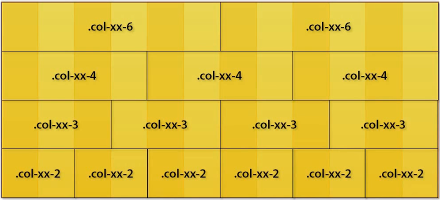
Grid system
Bootstrap’s grid system is built with flexbox and allows up to 12 columns across the page.
The columns will re-arrange automatically depending on the screen size.
Bootstrap 3, 4 include the concept of multiple grids, these are separate grids for each of the different resolution.
Grid system has 5 classes:
- .col- (extra small devices - screen width <= 576px)
- .col-sm (small devices - screen width >= 576px)
- .col-md (medium devices - screen width >= 768px)
- .col-lg (large devices - screen width >= 992px)
- .col-xl (xlarge devices - screen width >= 1200px)
You have to create a row. Then, add the desired number of columns.
Ex:
<div class="row">
    <div class="col-sm-4">.col-sm-4</div>
    <div class="col-sm-8">.col-sm-8</div>
</div>
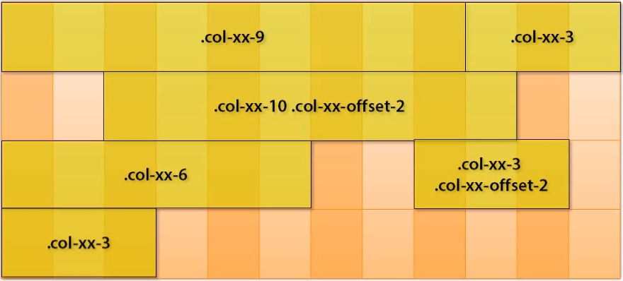
If you want to choose the offset value for the column, you can do with the below guides:
Using the multiple grids make your website flexible when user opens the website with the different screens. With the each specify screen, the responsed grid will be choosed.
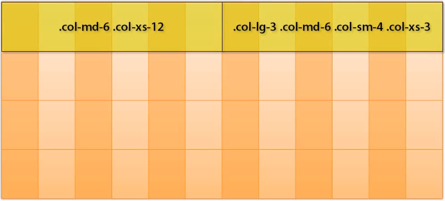
Ex: Sample for using multiple grids.
<div id="page">
    <header class="container">
    </header>
    <section id="body" class="container">
        <section id="main" class="col-md-8 col-sm-9"></section>
    </section>
    <section id="sidebar" class="col-md-4 col-sm-3"></section>
    <footer class="container">...</footer>
</div>
Note:
- Image is got from the “Bootstrap 3” course in pluralsight.com
Naviagtion bar
A navigation bar is a navigation header that is placed at the top of the page.
With navigation bar, it has two state that depends on the size of screen:
- expand
- collapse
One .navbar can contains one or many .navbar-nav. To split up the position among the .navbar-nav, you can use the mr-auto (margin right auto) class or ml-auto (margin left auto).
And in .navbar, you also use with form.
The inside of .navbar-nav contains many .nav-item.
With .navbar class, you can use to accompany with some class .nav-bar-expand-xl|lg|md|sm.
.justify-content-center make the .navbar lie at the center of the navigation bar.
In order to change the state of nav-item between active and disabled, you can use active class and disabled class.
Ex:
<nav class="navbar navbar-expand-sm bg-light justify-content-center">
    <a class="navbar-brand" href="#">HOME</a>   <!-- (1) -->
    <a class="navbar-brand" href="#">   <!-- (2) -->
        <img src="./img/...">
    </a>
    <ul class="navbar-nav">
        <li class="nav-item">  <!-- (3) -->
            <a class="nav-link navbar-brand" href="#">Name of website</a>
        </li>
        <li class="nav-item active">
            <a class="nav-link" href="#">HTML</a>
        </li>
        <li class="nav-item disabled">
            <a class="nav-link" href="#">CSS</a>
        </li>
        <li class="nav-item">
            <a class="nav-link" href="#">Javascript</a>
        </li>
    </ul>
</nav>
Beside the navigation item, you can insert the .navbar-brand to display the name or logo of website. You can place the .navbar-brand at the above (1), (2) and (3).
When the size of screen is made smaller than the begining point, you can use the collapse state to hide the navbar-items.
You can use some class that is related to the collapse state:
- collapse
- navbar-collapse
- navbar-toggler
Ex:
<nav class="navbar navbar-expand-sm navbar-dark fixed-top">
    <a class="navbar-brand" href="#">Name of website</a>

    <!-- Collapse button -->
    <button class="navbar-toggler" type="button" data-toggle="collapse" data-target="#collapse-navbar">
        <span class="navbar-toggler-icon"></span>
    </button>

    <div class="collapse navbar-collapse" id="collapse-navbar">
        <ul class="navbar-nav ml-auto">
            <li class="nav-item active">
                <a class="nav-link" href="#">HTML</a>
            </li>
            <li class="nav-item disabled">
                <a class="nav-link" href="#">CSS</a>
            </li>
            <li class="nav-item">
                <a class="nav-link" href="#">Javascript</a>
            </li>
        </ul>
        <ul class="navbar-nav mr-auto">
            <form class="form-inline" action="/page">
                <input class="form-control mr-sm-2" type="text" placeholder="Search">
                <button class="btn btn-warning" type="submit">Search</button>
            </form>
        </ul>
    </div>
</nav>
When you want to squeeze some items in .nav-item, you can use the dropdown class in .nav-item.
Ex:
<li class="nav-item dropdown">
    <a class="nav-link dropdown-toggle" href="#" id="drop-navitem" data-toggle="dropdown">Front-end</a>
    <div class="dropdown-menu">
        <a class="dropdown-item" href="#">Javascript</a>
        <a class="dropdown-item" href="#">CSS</a>
        <a class="dropdown-item" href="#">HTML</a>
    </div>
</li>
Thanks for our reading.